
The surprising power of joy
OCTAVO Update 3

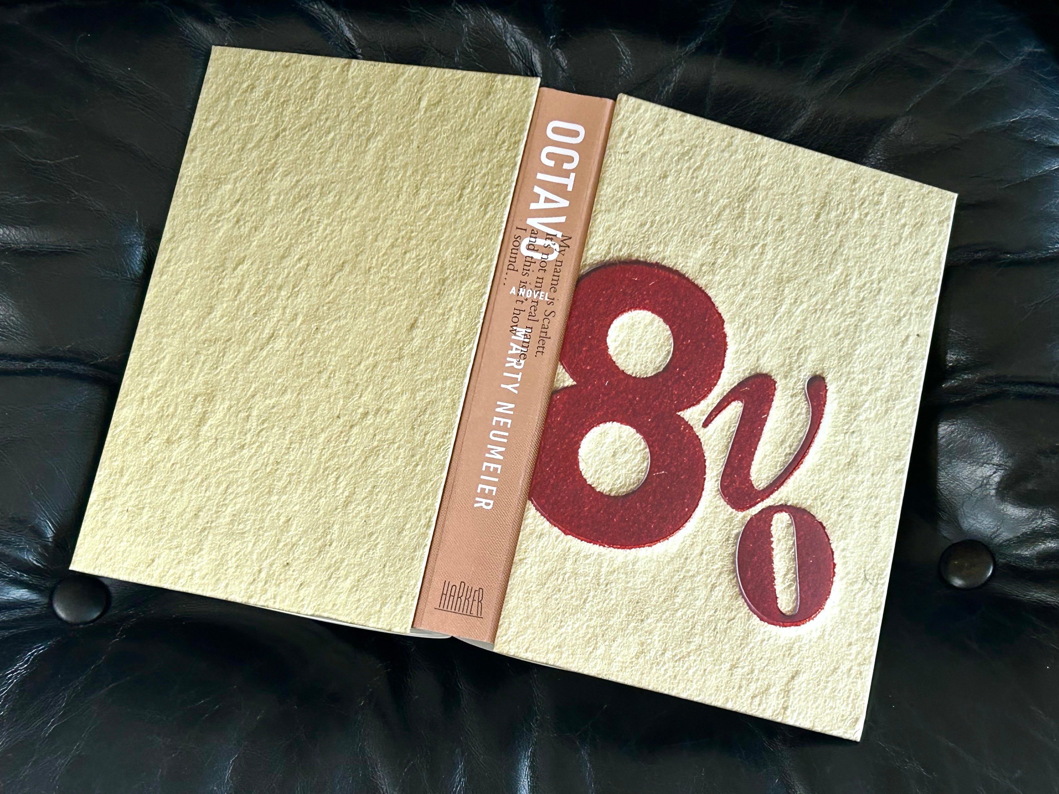
UPDATE: The commercial versions of OCTAVO are set to launch on October 14. The hardcover and softcover are uploaded to Amazon and Ingram; the audiobook is finished and set to go on Audible, Spotify, and other sites; the ebook is in final production; and the signed-and-numbered deluxe versions are going out to Founding subscribers now. (If you want one, there’s still time to upgrade.)
Today I’m freeing up an another post from the Premium side. Joy is a state of mind that creativity produces while in a state of flow. It’s actually hard to have one without the other. In Octavo, Leonardo was able to experience joy despite—or because of—his dissection of the murder victim’s body. Most of us experience joy in less macabre creative pursuits.
The surprising power of joy.
Joy, it seems, can be found anywhere if you look for it. In Episode 5, Leonardo finds it in the morgue, where he goes with Melzi to perform an autopsy on the crucified man.
After midnight we set out for the cemetery with a blanket concealing surgical tools and two dozen candles. As we walked, a slim moon led the way, darting ahead on the oily surface of the canal. Cats, both lissome and lame, slipped out from shadows, over bridges, and into narrow alleyways, looking for rodents and rotting pieces of fish.
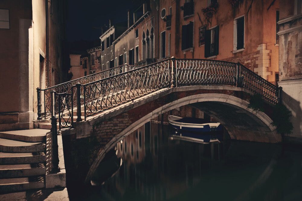
Finally, we rounded a corner and beheld the church, a dark mass of bricks and tombstones—quite still, yet somehow alive. Glints of silver, reflections of the scant moon on scores of ex-votos, animated the exterior walls of the church. I ventured forward and ran my fingers over votives for broken legs, failing eyes, aching teeth, mangled hands, breasts, lungs, a uterus, a scrotum. Had the votives accomplished their purpose? Or do the victims now lay quiet in their graves, their prayers unanswered?
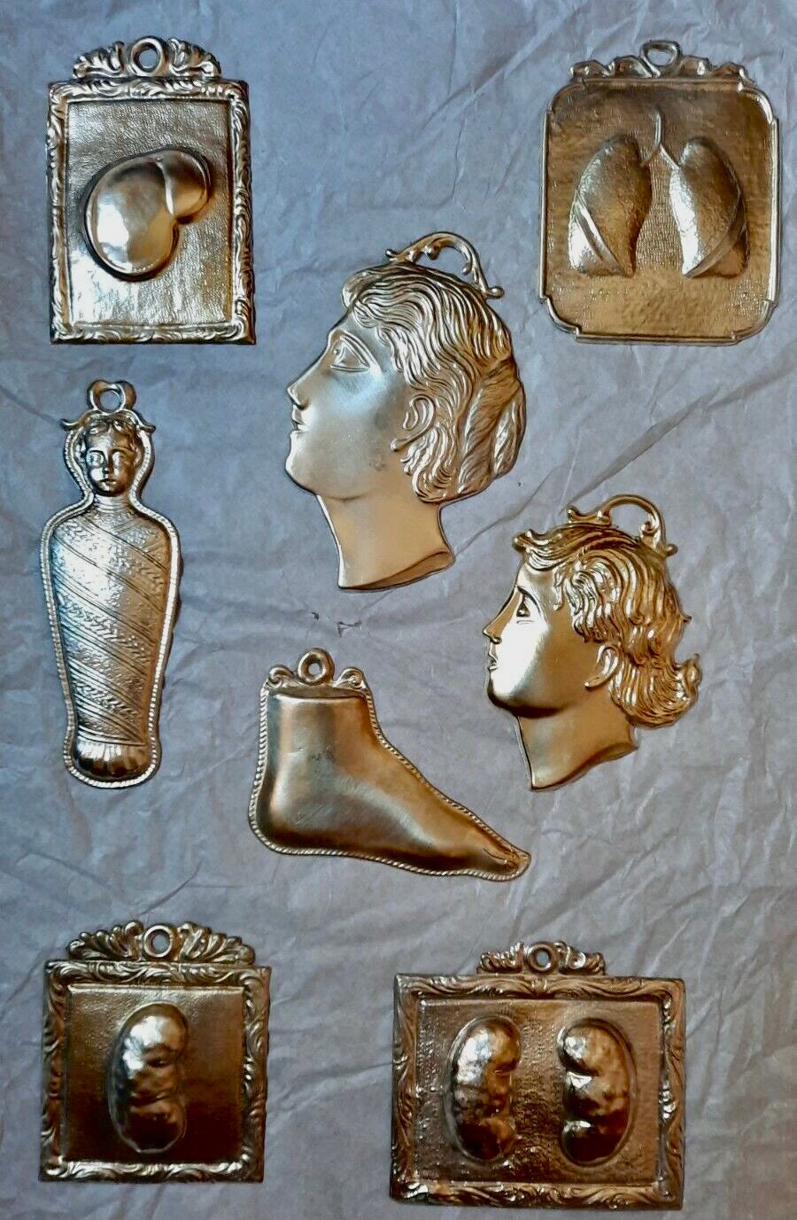
Ex-votos, from the Latin “vow,” are small plaques of polished metal molded into various body parts to represent ailments that required spiritual interventions. Worshippers would leave these on the walls of churches as either prayers or tokens of thanks. In Octavo I used them as portents of the gruesome sights to come.
When Leonardo begins his work in the morgue, he’s fully in his element. Not because he’s kinky for cadavers or loves cutting flesh, but because he’s happiest when he’s on the hunt for knowledge. He rubs his hands and whistles a merry tune as he works. Meanwhile, his pupil runs to the corner to empty his stomach. Says Leonardo:
“Now, now, Checco. You must not allow your emotions to reign at a time like this. The dead man is no longer a man, but an interesting collection of evidence.”
When Melzi summons up the courage to look closely, he reports:
More frightening than the bloated body was the man’s crushed head, which looked like a prehistoric fish, half white, half crimson, the passage from Dante dark purple on his cheek. His eyes were open wider than human eyes should ever be, protruding wildly from their sockets. It was as if he had glimpsed the gates of Hell precisely at the moment of his death. I looked closer to see if an image of the murderer had been recorded on his pupils, as some say happens. But instead, his eyes were dull and blank. “Superstition!” cried Leonardo, without pausing to look.
Melzi asks Leonardo why he bothered with insoluble riddles. Leonardo says:
“Checco, I could no more ignore this riddle than I could ignore the question of how birds fly or why fishbones are found on the tops of mountains. What are philosophical questions but riddles? Every mystery is a twisted knot with a hidden order. Whenever I find a mystery, I am powerless to prevent my mind from trying to untangle it.”
Here we see Leonardo’s driving force: his insatiable curiosity. Have you ever noticed that that curiosity, when followed by the joy of discovery or creation, becomes addictive? My mentor always said that creativity is like dipping your finger in sugar. With every taste, you want another. Curiosity leads to creative joy, and joy leads to learning. Over time, insoluble riddles become clear. Leonardo says to Checco:
A dead body is like a book. Nothing is hidden if you know how to read. But in this case, there is actual printing, not metaphorical printing, and it makes the book illegible.”
Book talk.
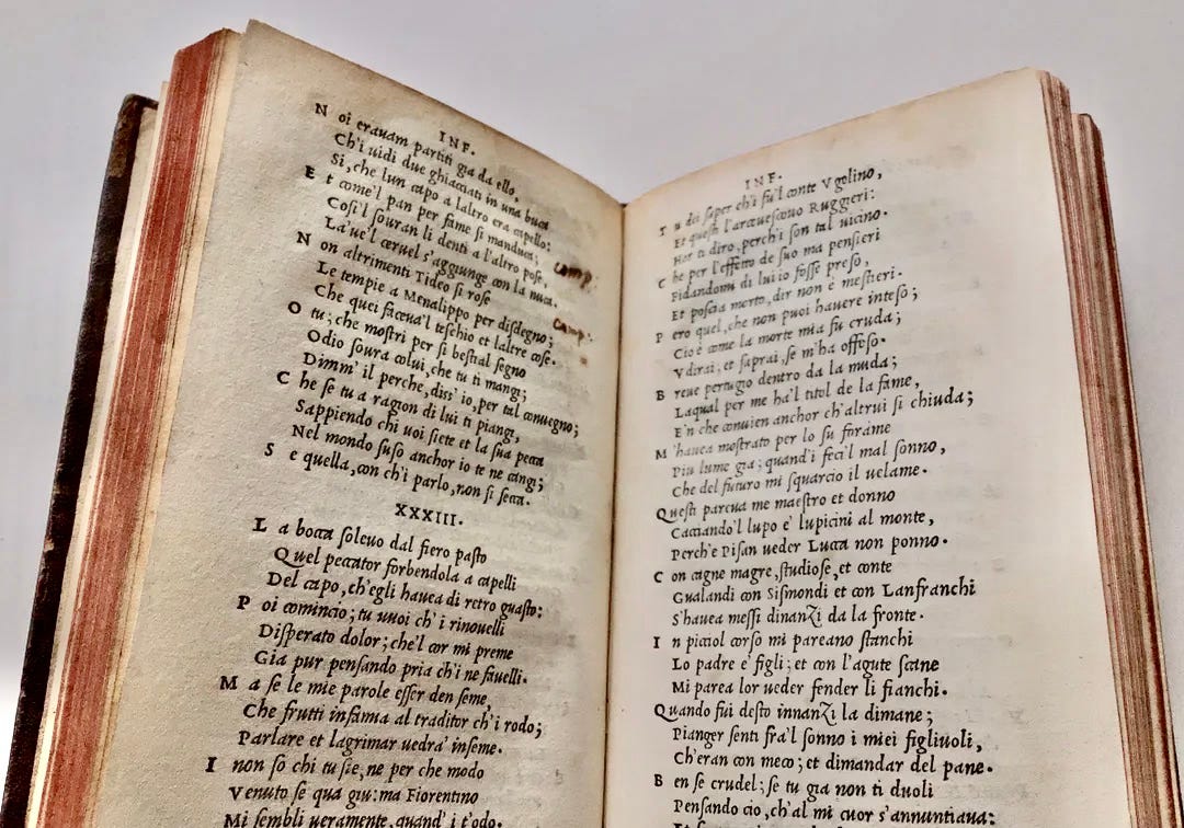
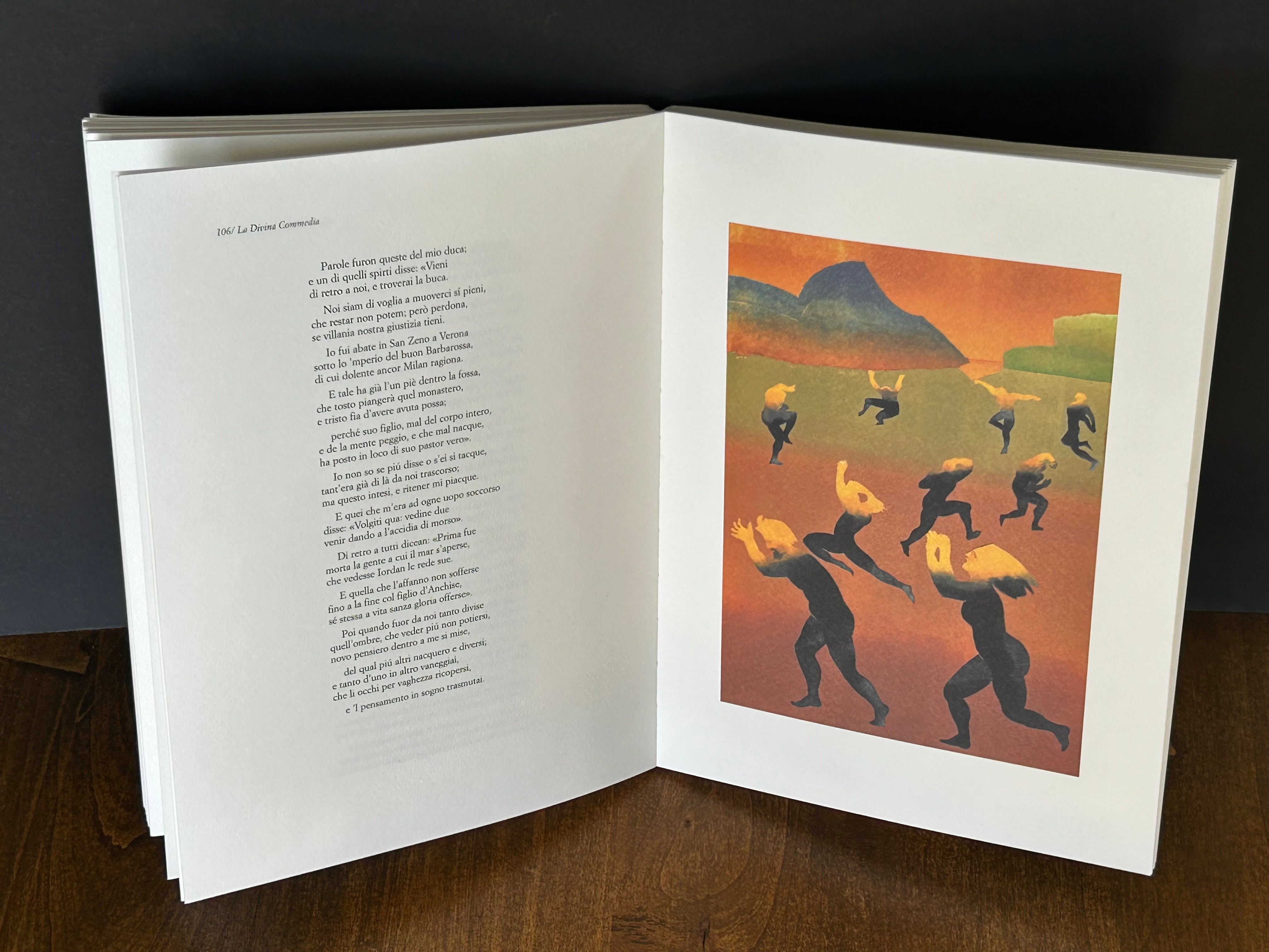
The passage pressed into the man’s face was made from a typeface designed by Francesco Griffo and used in Pietro Bembo’s Italian translation of Dante’s La Divina Commedia. Below is a rare first edition. Look closely and you’ll notice how the letters have been embossed onto the page. That’s the look of letterpress, the effect of inked metal type pressing into the surface of the paper.
These days letterpress is too expensive to compete with offset and digital printing. You still see it on special items like wedding invitations and place cards for elegant dinners, but it was never suitable for full-color.
The color version of La Divina Commedia shown below, printed by an Italian publisher on an offset press, was designed and illustrated by Milton Glaser. I’ll go out on a limb and say Glaser was the finest American graphic designer of my generation. He not only designed like an angel, but illustrated, wrote, and conceptualized with the best artists of all time. I’m sure you know his much-imitated “I [heart] NY” bumper sticker, and you may remember his Bob Dylan rainbow-hair poster from the sixties. But most of his best work was deeper and more thoughtful than these popular examples.
He and I had become friends through my magazine Critique, and we often exchanged letters, favors, and gifts. I’d send him dried Porcini mushrooms from my trips to Italy, and he’d send me thank-you drawings or personalized books, like this illustrated version of Dante.
With this particular book came a letter, written in a playful cursive hand. It said: “In reading Dante this year I learned that the only difference between those unfortunates in Hell and those in Purgatory was that the former had no idea of how they had sinned.” The letter concluded, “All of which seems like an appropriate subject for our new millennium.” When I read this again, I wanted to cry.
Design talk.
To most people, typography is largely invisible. It’s just “writing.” A means of making words visible. Most of us can’t tell a Bodoni from a Bandini or a Franklin from a fruit bowl. Why should we? And yet particular shapes of letters exert a subtle pull on our emotions, and make stories and ideas more (or less) engaging, depending on how they’re selected and arranged. The best typography is often invisible on purpose, like looking through a pane of glass to the meaning of what’s being said. This may be why typefaces have changed so little since the Renaissance. How can you improve on perfect clarity?
I’ll let you in on a trade secret. The easiest way to tell typefaces apart is to memorize the differences between their lower-case Gs. For some reason, maybe tradition, the lower-case Gs are where type designers like to exercise their professional flair. Compare the lower-case G of the Aldine Press’s italics (designed by Francesco Griffo) with the lower-case G of Stempel’s Palatino-Kursiv (designed by Hermann Zapf).
Clearly, Zapf’s italic was heavily influenced by Griffo’s italic, the first of its kind. While the two Gs are similar, they’re also distinctive. Griffo’s G seems to be recoiling from the other letters, whereas Zapf’s G is riding higher and leaning forward, its lower loop slightly squashed. In a world of lookalike typefaces, the lower-case G is often the tell.
In 1986, while working on an article about Apple’s design achievements, I was invited to a lecture by Hermann Zapf at the Cupertino headquarters. Zapf and his company Stempel had just licensed Palatino to Apple for use on Macintosh computers. I sat in the second row a small auditorium, directly behind a shoeless Steve Jobs who whispered nonstop into the ear of his giggling girlfriend. At the end of the lecture the audience members filtered out, leaving me alone with Zapf. He looked slightly hurt by their inattentiveness, so I invited him to lunch in the campus cafeteria.
Between bites of pasta salad, I asked him if he thought there was room for more innovation in the design of letterforms. “We don’t need any new letterforms,” he said. “We need better automation of the letterforms we have.” That sounded right to me at the time. But it hasn’t stopped eager geniuses like Tobias-Frere Jones or Erik Spiekermann from inventing beautiful new faces. The design of new fonts, far from slowing down, has actually sped up, thanks to the ease and precision of digital systems and the joyful ambitions of creators.
Murder of the week.
When I think about joy, I often return to the concept of flow, a simple framework put forward by the late Professor Mihaly Csikszentmihalyi (ME-high CHEEK-sent-ME-high). It’s a state of optimal experience—the feeling of being in control of your actions, the master of your fate. It happens in the narrow space between boredom on one hand and frustration on the other. If a task is too easy, what happens? You lose interest. If it’s too hard, what happens? You give up. The space in the middle—where a task is neither too easy nor too hard—is the joy zone.

For creators, most of our optimal experiences occur with projects that are goal-directed, not aimless, and are bounded by rules, often of our own making. Creative projects require an investment of psychic energy, and they can’t be done without the necessary skills. Some projects are competitive in nature, and that’s okay, but only if competition is a means to perfect one’s skills; when competition becomes an end in itself, it often ceases to be joyful.
Like happiness, joy is elusive. Willing yourself to be happy is a little like trying to eat a bowl of ice cream with chopsticks. Most of it melts before it reaches your mouth. But happiness seems to come unbidden whenever you’re working (or playing) at something you love.
The best moments, said Professor C, are when your body and mind is stretched to the limit in a voluntary effort to accomplish something difficult and worthwhile. “It’s what the sailor holding a tight course feels when the wind whips through her hair,” he said. “It’s what a painter feels when the colors on the canvas begin to set up a magnetic tension with each other, and a new thing, a living form, takes shape in front of the astonished creator.” (Read Ted Gioia’s extended riff on flow.)
I remember catching the drawing bug from my mother when I was about six. She’d stand chatting at the telephone nook, absent-mindedly sketching the most beautiful faces on a pad as she talked. To me it seemed like a magic. By the time I was seven I knew I would be an artist.
Today joyful work is under attack. For many people it’s already dead. For some it was killed by the pressure of student loans, which required graduates to accept soul-depleting work to pay them down. For others it died much earlier by at the hands of factory-style education, in which students are measured by tests and grades instead of joy and flow. Who hasn’t at one time or another felt that school was more prison than playground? It wasn’t until I switched from an academic university to an art school that I felt the exhilaration and power of joyful work.
This is what some people call ludic learning, or learning from playing. What makes it especially powerful is the space it allows for positive emotions. Emotions drive attention, and attention drives learning. “Learning,” said Richard Saul Wurman, “is just finding out more about what you’re interested in.” Wurman worked variously as a cartographer, architect, information designer, artist, author, publisher, and founder of the TED conferences. He told me in an interview, “I always look for subjects that I find interesting but that I don’t completely understand.”
It's been my experience that when you follow your curiosity, your learning takes a joyful leap. Joy, in the context of a project, operates like a flywheel. It requires motivation to get the flywheel moving, but once it starts, it’s hard to stop. It continues to release its energy with little additional effort. In Octavo, Peter questions Scarlett and Artie about the strength of their motivation. He wants to make sure they’ve got what it takes to see the project through.
Says Artie:
I was unprepared for Scarlett’s intensity. Whilst I confess to being swept up in her crusade, I believed our chances of success lay somewhere between zero and none. Scarlett says I have a no-can-do attitude. And yet she makes me wonder if I might not be one of those desert plants that grows slowly and predictably for a hundred years, only to explode with the most spectacular display of flowers imaginable.
The two women say the same thing: it’s their destiny. Both are products of a factory-style education, but they’ve stepped out of the machinery to do something they believe in—something that brings them joy—bringing Leonardo’s secrets to a world in need of new thinking.
Your turn.
What about you? What kinds of activities or projects give you joy? Under what circumstances do you find yourself losing track of time? Where do you find inspiration for what you love to do? To what extent does Professor C’s theory of flow explain Leonardo’s ability to discover and create with such intensity and regularity?
Virginia Woolf famously said that one could not be a writer without 500 pounds a year and a room of one’s own. What keeps you from doing the kind of work you want to do? Space, time, money, freedom from commitments? Do you have any workarounds for these? I’d love to read your tips.
Of course, I’d also love your take on the story itself. The beauty of serialization is that there’s always a chance to improve the text before the final book is released.
Wherever our journey takes us, I want to you to know that I don’t take your company lightly. Your support is truly a gift to me, and to the rest of our little community.
See you next week!
If you enjoyed this peek at the Premium side of The Scarlett Files, please think about supporting me with a Premium or even Founding membership.
(Founders get a copy of the exclusive deluxe hardcover shown below, signed and numbered by yours truly. They cost $60 each to produce and won’t be available in stores. Get one before the launch!)
This week on the Premium side you can read “The Untied States,” my provocative post about the future of American democracy.
Reading is the earliest recollection I have of being in a flow state. I might be able to narrow it down even further: reading the back of cereal boxes. When I grew up the back of a cereal box (before I was allowed to discover comic books) was an enchanted world.
For the price of a few boxtops (OK, many, many boxtops) you could have: plastic dinosaurs, Hot Wheels cars, magic decoder rings, sea monkeys, secret agent spy kits, even rocket ships and ray guns.
I recall pouring over every word, lost in a fantasy world filled with adventures. I have absolutely no recollection of which cereal I may have been eating at the time.
What I remember most is waiting, and waiting, and waiting for the mailman to deliver my Kellogg's atomic submarine. It became a real love-hate relationship with the US Postal Service for me...
Dear Marty,
I’ve been assigning your books as reading in my Branding & Messaging class at Pratt for many years, especially The Brand Gap. And I have to admit that I’m doing this with a certain swagger “Look what kind of amazing book about branding I have here, one that will transform your understanding of brands in ways you can’t even conceive of right now.”
So when you reached out to me with an offer to read an advance copy of a piece of fiction, I was, like, wait, what's going on, who is Marty now, is he done writing about brands, has retired and is now tending his garden (or writing fiction)?
The moment I started reading, I was hooked. Intrigued by the characters, the plot, the location, the examination of a genius who we’re still talking about and revering half a millennium after his time, all woven into a world that is seemingly controlled or, at least, manhandled by people with too much money and ego, disregard for laws written for a world that operated by different rules, and fought by those who are subversive for all the right reasons.
And I love a good mystery, trying to track the sprinkled clues that don’t come together until later in the story to reveal plots upon plots.
As a designer by trade, and someone who grew up close to the printing industry (at 15, my summer job was making printing plates for 4-color press proofs in my dad’s shop, surrounded by the smell of ink, chemicals, film and paper) I ate up all the printing and type history woven into the story.
Eventually, I started to recognize most, if not all of the layers in your project. The mystery fiction, the conversational structure, the historical accounts, the documentation of the artifacts, the historical figures and their relationships, the beautiful synchronicity between the structure of the story and its layered release in a variety of forms, the design of the story as a documentation of communications across different formats and platforms, constructing a mirror between Leonardo’s time and ours in the process.
One of my design mantras is to make the delivery evidence of the message. Octavo is one of the most beautiful examples demonstrating that idea, and it will help me to better illustrate the concept to my students.
As if all of this were not enough, your solution of publishing the book yourself, on your own terms, inventing a system in the process, is born out of the same subversive spirit that is fueling your lead characters in the story. I kept asking myself who you are in the story. It appears that you’re a little bit in all of them.
Octavo is an incredible ride, at a breakneck pace, that I was thrilled to be part of before its official release.
I appreciate the brand that Octavo is becoming and look forward to seeing all the places it will go. Can't wait to go see the movie. I wonder what Gary Hustwit is up to...
With gratitude,
Sebastian